Funnily enough, I decided to take book cover designs seriously after a would be client said they had to go with their publisher’s book cover artist.
I had the design brainstorming in my head, done my research and was eager to start the discussion with the author and it was poof, all gone.
I then realized how much I like the process of making the book covers, and thought “well, they are really missing out!” and thought to go out there and actually put more effort in.
Previously I had been just putting my book covers online and never advertised, just let people find me. But the fire was lit! I made a instagram page, facebook page, started a competition, made connections, bought so much photos and fonts, studied a bit more, and my spare times filled with browsing book covers.
So! If you’re wanting book covers, talk to me! or come visit and you can see how it works here :)
I’ll kick off with my Fun Book Covers.
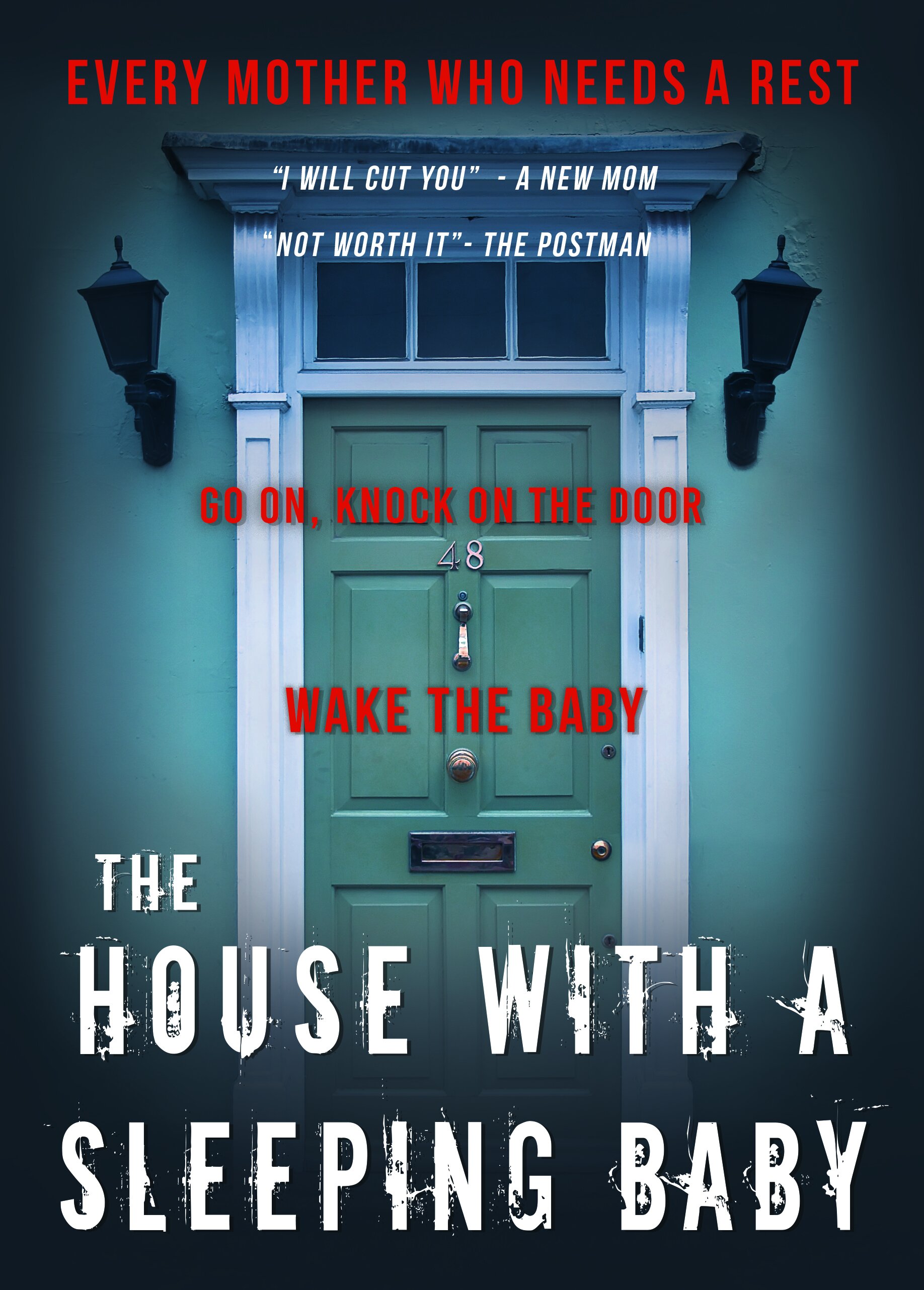
I decided to whip up a mock book cover to practice genre, theme and skills. The challenge is that the book cover creation process cannot take more than half a day because this is a mock up. Not an actual product! I do get ambitious though…
Let’s start with this one:
I’m currently working with a client for their thriller novel, so I was doing a bit of research on the genre.
Horror/Thriller genres:
A lot of Blue/orange tone
There’s a lot of small lines like “Who killed XYZ?” “What happened to XYZ?” etc.
There’s a lot of text in horror/thriller book covers
A lot of low angle shots.
People’s faces are obscured.
A lot of female/children images in there. (The whole vulnerable people/ fear of unknown/ making you feel small elements are used!)
Text are usually sans serif
Text colours are usually quite bright. Whether it is red/white or yellow. Pretty fun
Edges are usually all black
A lot of house over the hill images, while the text is underground.
A lot of photos. not many hand drawn. But some I’ve seen. Wow. They are amazing. I think if you have a great cover designer, they can make you a hand drawn one. At a lot more cost than a photo though.
So if you’re a thriller/horror writer, keep these in mind! :)
My process with the above picture. (It looks lighter online here…)
Come up with an idea. I started with wanting a horror/thriller book cover but relating to mums. (After all, I am one, and I like funny)
Come up with a title. Wow that was hard. That itself took two days?
Find images. (I doubt I’ll ever hand draw a mock book cover. It takes way longer than finding a photo)
Play with different images, work with fonts/title and see which one suits well. I had three images at first, one had the entire house, the other had a door knocker close up.
Font… I didn’t put too much thought. Just whatever I liked. Looking back, if this was a client’s one, I probably wouldn’t use that font. Fun fonts are good, but can look tacky if not careful.
decided to go with blue tone rather than sepia.
Difficulty with this image was that it was too small to fit my canvas. Stretching an image is a no-no. You do not want to stretch your image. So I had to draw the edges to match the middle image.
Play with colour/contrast/gradient.
Add texture to the walls and door so it wasn’t so shiny and new.
Finished!
What can I do better with more time?
Would definitely put more contrast. Make the door really pop out.
Change Font for title.
This thing took… 3 hours, not including coming up with the idea. Hoping I can get faster.
