What fun title!
One thing I love working with Mike Johnson is due to his quirky titles.
So! I didn't have time to read this novel this time - due to my own being published and a gasp - a baby on the way! Surprise!
So in events like this - I ask the authors to tell me about their novel and what they love about it.
Aside from the name I could tell it was a fun, whimsical and crazy kind of book.
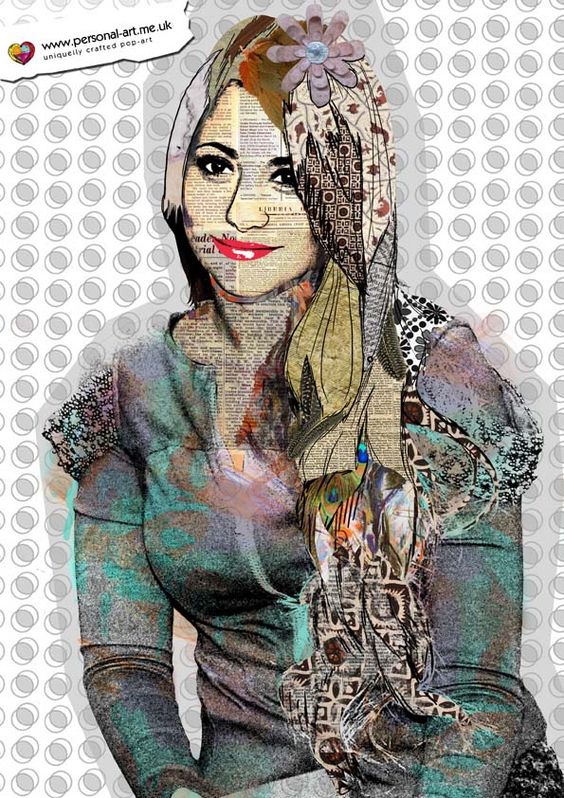
So I wanted to try doing a collage style of books!
Just some examples I've found on Pinterest!
So I spoke with the author, ran my ideas with him and he was (as usual) happy to go along with it! So I gave him few collage pictures I've found online to ask which style he preferred. He chose one, and off I went.
Now - everyone knows I avoid stock photos because:
A: I don't want my authors to have the same cover as someone else.
B: That weird selling more than 500,000 copies thing... part on their contract annoys me!
But... when it comes to making a collage book cover... I was sorely tempted to get one!
Luckily I was able to find high quality photos that I've taken! Yay for travelling! And also free rights photos (Wow they are hard to find)
And of course I was able to draw a lot of things and use textures to make them look like cut and paste versions.
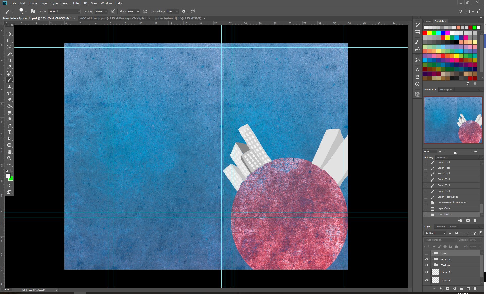
So Step one as usual: is the Green lines:
Step two:
I didn't do outlines, I just started to draw as collages don't have outlines!
Got some nice textures, thought of Blue - for space and just crazy red/purple/pink for a nice contrast.
(As you can see - at this stage, I wasn't sure what size the author wanted the book or the final page numbers... (no template) so I am using an approx measurement from an old book cover template I had.
Step three:
Added a moon and Buddha as it's relevant to the story. Also a splash of color at the back to make the back look a bit interesting.
Step four:
Draw the actual Zombie. It took a while trying to decide what style to draw the zombie... should I have the edges like it's been cut out? Should I put a newspaper texture over him? In the end I decided just clean white with shading will pop out.
Add him in... give him some shading...
Step five:
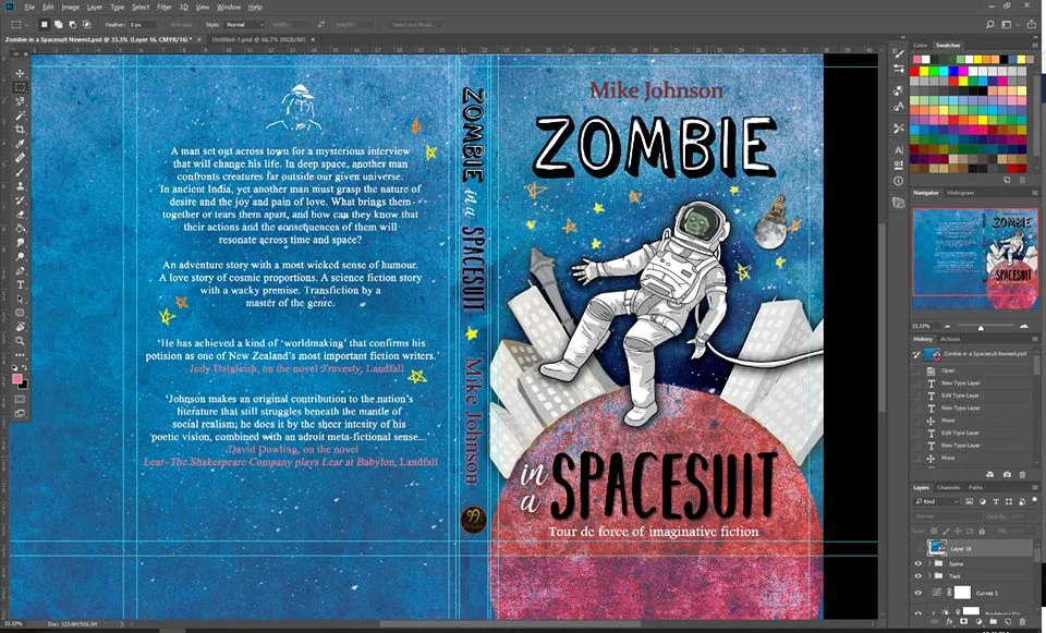
Go and find a lovely font for the front, spine and back! I loooove Dafont.com
Had the blurb from the author so added that in.
Had some reviews from him too - so added that in.
Step six!:
Now to bring on critiques that I trust... (It's super important that you're not just asking any random person for feedback... I recommend someone that's proven to give you constructive feedback and someone that isn't afraid to tell you you've done something off.)
I fortunately have two art critiques that has art background and also proven to give me amazing feedback, so have sent it to them.
Also asking husband because of his design background... he is amazing with typography.
And of course... the author's feedback is important too! If he hates it, then it's back to the drawing board... but at this stage I would charge for that time. Luckily he liked it!
Step Seven!:
Usually this would be the last step... just touch ups - convert to PDF... but there are some issues! Page numbers may change! Reviews and blurb needs to be proof read! (Even if it has been proof read, it's good to have one more check before it's finalized)
So... once that's done! It'll be sent off! :D


