I've been getting few questions about how I do my work - and like - really. How exactly I do this.
I don't have a secret when it comes to doing these work, so I thought I'd share my work :)
First step:
I talk to the client/author. As much as I appreciate their trust in me, I also want to know what they want in their book cover. If I don't have time to read their book, I ask them to tell me what their book is about. Usually they are amazing at giving me images and I can pick up what is important to them when they tell me what kind of stories they are telling.
After this - it takes usually a week or two for it to brainstorm in my head.
I look at A LOT of book covers. If anything jumps out - then I save them - look through them again.
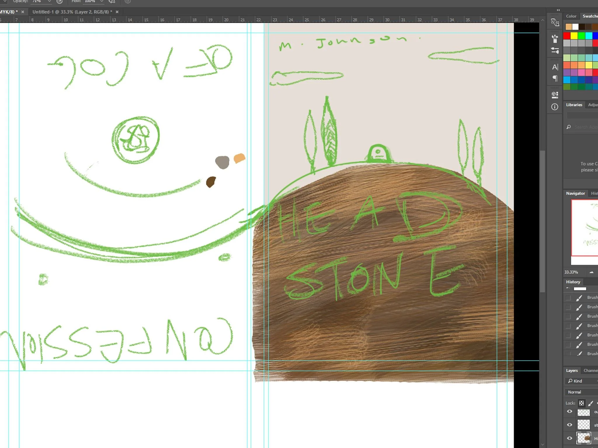
Once I have an idea, I sketch.

Yes. Beautiful.

This book cover is meant to be 2 book covers in one book - so I'm going to work on the one to the right first.
I put some colors I've had in mind to see what works.
I've decided I was going to go with a rough, brush like feel with this cover. I've focused it being abstract, slightly strange and mute colors.
Yup - I think I'm happy with this color. The tree kind of makes it into a face... maybe I'll keep it... It could be a metaphor...
(At this point I have an idea what colors I want so I didn't have to do too many trials with colors. You can see I tried to see how it would look with a darker sky at the back, but it didn't work)
* If I'm stuck I go online and look at color pallets associated with the color I really want - and at this stage it's that beige color*
Details details
The hill came out darker... but I like it! Luckily I didn't have to make a brush for this - yay for photoshop brushes! Let's keep the hill like this and move onto the other things!

Moved onto drawing the stuff on the hills! I have a texture in mind for them so I wanted them as blocky as possible.. .but... mmm not much space. I can edit it later The hills look really empty. Let's move onto the Hills
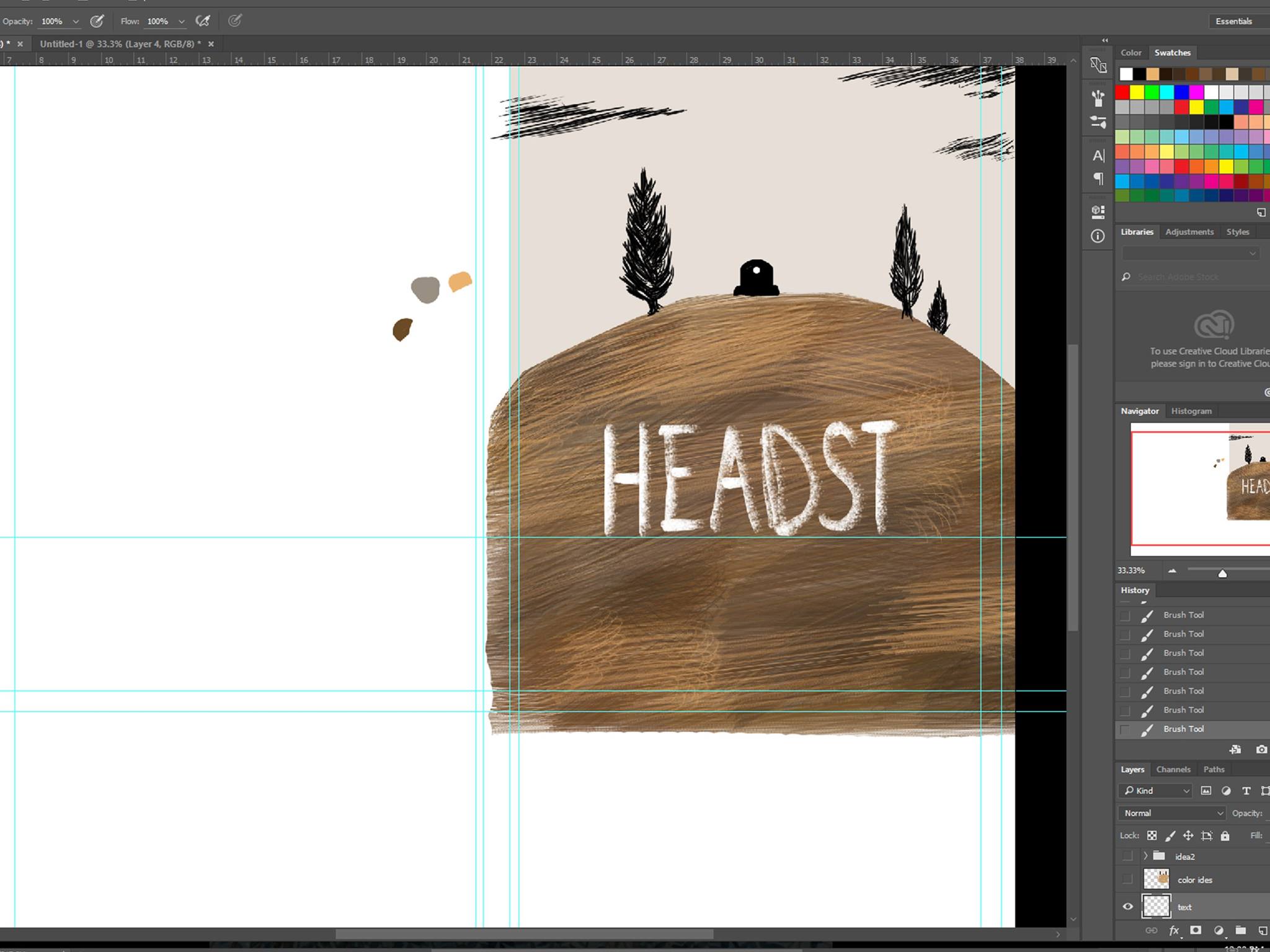
Oh crap I ran out of space... (I usually don't use my own handwriting on book covers... but there's a bit in the book about chalk and.... no spoilers!)

Resizing and underline for... good measure? I'm having doubts... time to check with my assistant! (Husband)
He just told me bluntly that it looks weird and that it looks like an adult is trying to pretend they are a child. Dammit husband.
Time to rely on artist friends for second opinion! The underline seems a bit of an overkill at this stage...
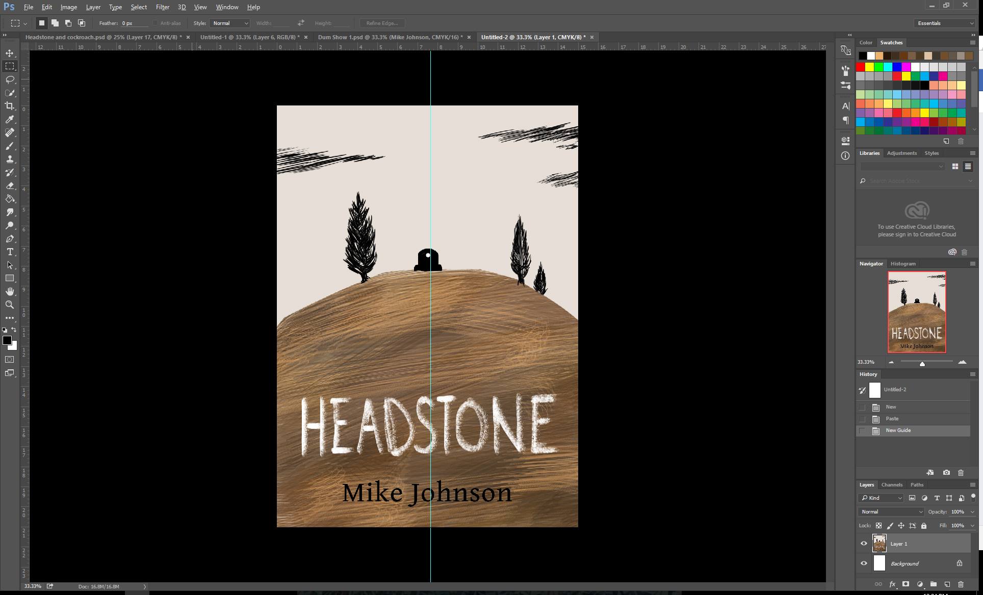
Yes the underlines were overkill. Let's get rid of it. Okay - now next - that second opinion. It was pointed out that the the view is slightly to the left. Is it because of the spine? Let's cut it out and check it out.
Nope - the eye does go slightly to the left. Let's see... the clouds and tree balance is good... let's move that tombstone. Nope - still to the left.
It's the shape of the hills? Let's cut that hill a bit more. Eye focus is really important for a book cover!

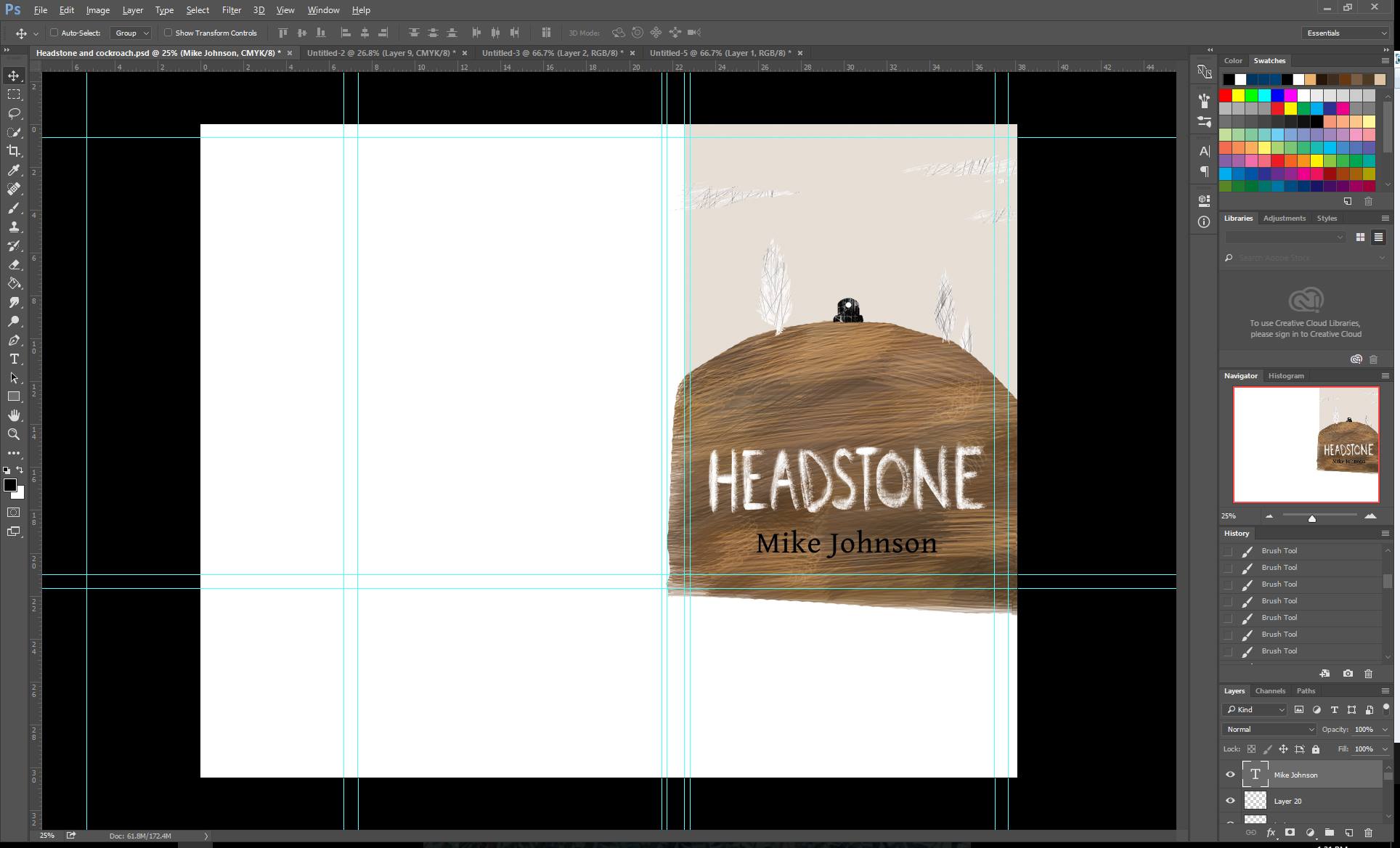
Okay - cut the hill, shifted the things... make sure everything is centred...? Oh crap the text isn't really centred... but the text may change... so will leave it for now. Let's texture those suckers on the hill.
(Back to the usual view)
Husband asked me to just handwrite it rather than using a font. He didn't believe me when I said I wrote that. He recommended it to be more 'chalk' like.
At this point I had to explain why I was using chalk to my two helpers. But then again you can't explain these things to readers... so hopefully they read the book and then click...
Textures in! But why do they look red... what... I'm sure I got rid of colors on my textures... I'll change that. Tried placing the author's name on the top but it didn't really work. So bottom it shall be!
Maybe I should play with the author's text? It's always been that font... but same font means I can make all the books have something in common....
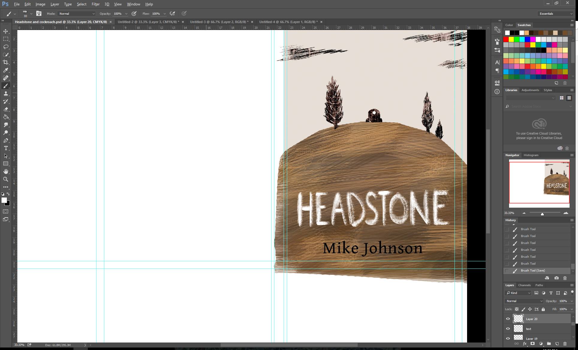
Hmmm now I'm playing with the idea of having everything except the tombstone white. It makes that pop out... but the sky looks empty...
The author's name makes the hills feel a bit emtpy.
Mm... the effect of an empty sky is pretty good...
Can't really think of what to put there except more scratched clouds. Need time to think. Will eat food, maybe work on something else before going ahead. Break time.

Sky is too light! Let's add a darker color to it! I think I want more texture in the background... but for now I"ll work on the other side.